Sophy
Hyde Park
Services provided
Art Direction, Branding, Design, PrintCreative
Art Director
Designer
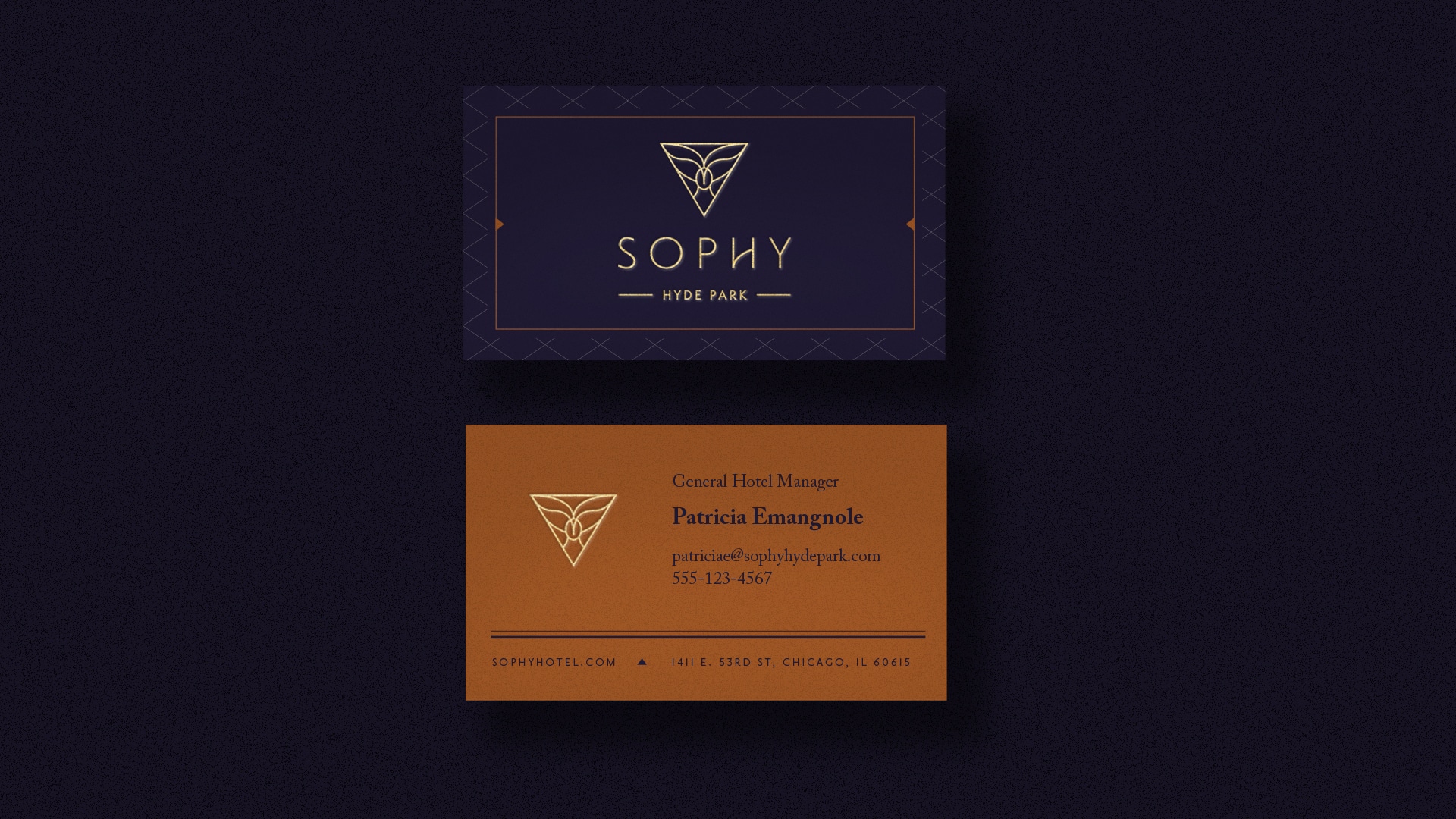


Sophy Hyde Park has a name rooted in knowledge, wisdom, and skill and comes from the Latin word “sophia.” Its visual identity gives proof to the brand’s sophisticated and intelligent approach to service and design. The logo mark contains three symbols: the great whale, the wise owl, and the powerful triangle of truth and intellect. Paired with a strong, feminine modern serif, the mark is smart, refined, purposeful, and thought-provoking.
The interiors of Sophy are vibrating with eclectic, layered patterns and work from local artists. A rich brand palette complements the vibrancy and was inspired by the rich blues of Moby Dick, worn leather books, and “golden” ratios. Traditional hairline patterns are paired with classic serif typefaces—the duo beautifully contrasts with the modern artwork and surreal photo direction.

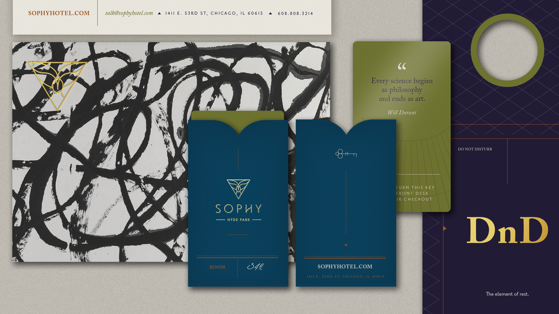
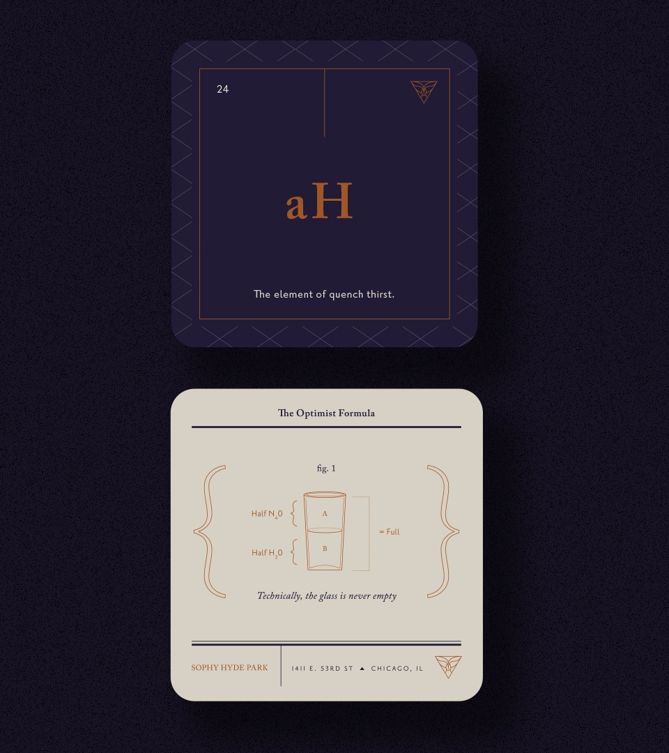
Each piece of collateral begs to be studied. Key cards share a collection of quotes from philosophers, designers, authors, and mathematicians. Inspiration was found in the efficient grid of the periodic table design; do-not-disturb signs and in-room coasters were designed to mimic the table but with an added element of wit.