Special Properties
Real Estate
Services provided
Art Direction, Branding, Collateral Design, Copy Writing, Design, Illustration, Logo and Identity, Print, Web DesignCreative
Art Director
Designer
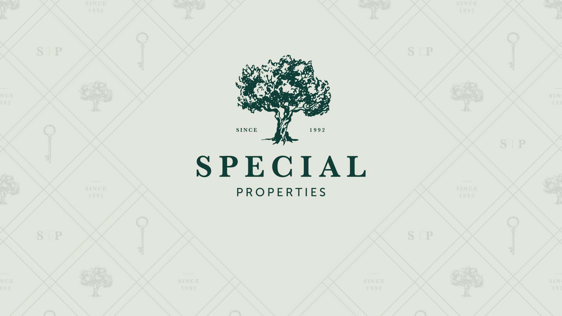
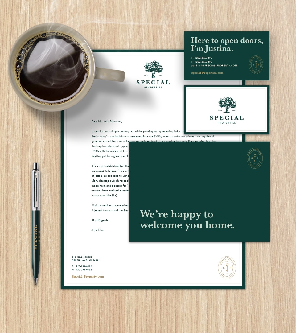

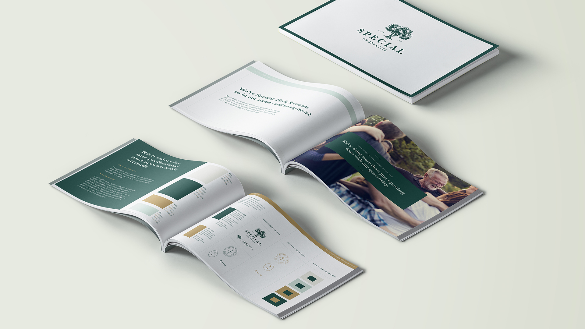
Special Properties is a familiar face in the small Green Lake community. Clients trust the small team with their family’s most precious heirlooms: their homes. Whether clients are looking to buy or sell, they reach out to their trusted neighbors to guide them on their journey. Special’s new visual brand embraces the company’s well-known tree symbol as well as a refined palette. Light-hearted and friendly copywriting is paired with clean and approachable design that was inspired by the quaintness of Green Lake, Wisconsin itself.
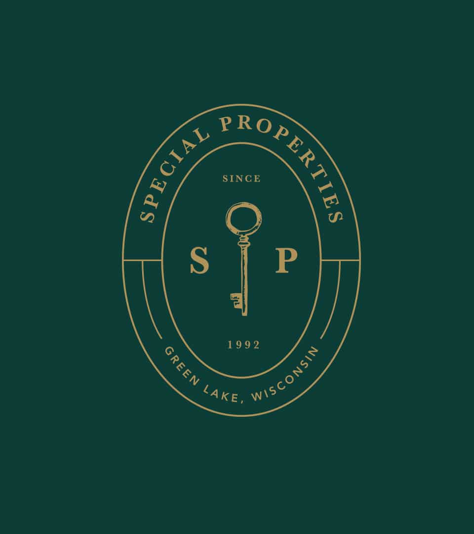
Special Properties offers clients the key to new memories and fresh perspectives as much as it offers them the actual keys to a new home. The rebranded identity refreshes the company’s old symbol of the tree and pairs it with a stately key to communicate confidence and security. Spending time in Green Lake is serene, and the air has a sweet nostalgia to it, so a rich color palette was selected based on a photograph of the town’s lakeside that featured splashes of the tree line and the golden reflection of the sun off the crystal lake.
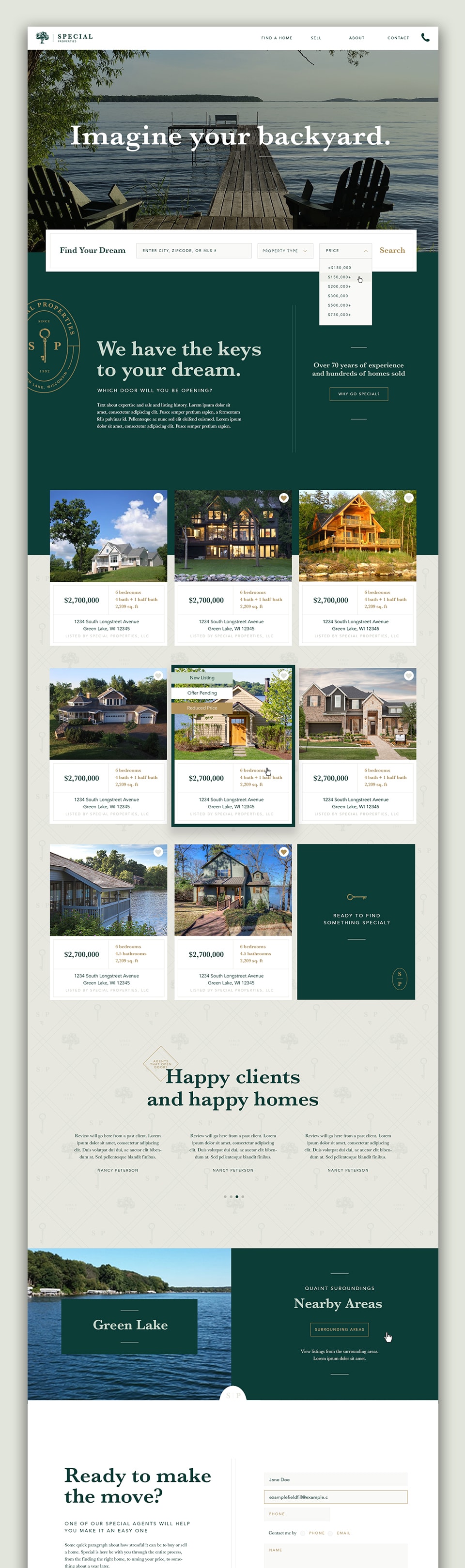
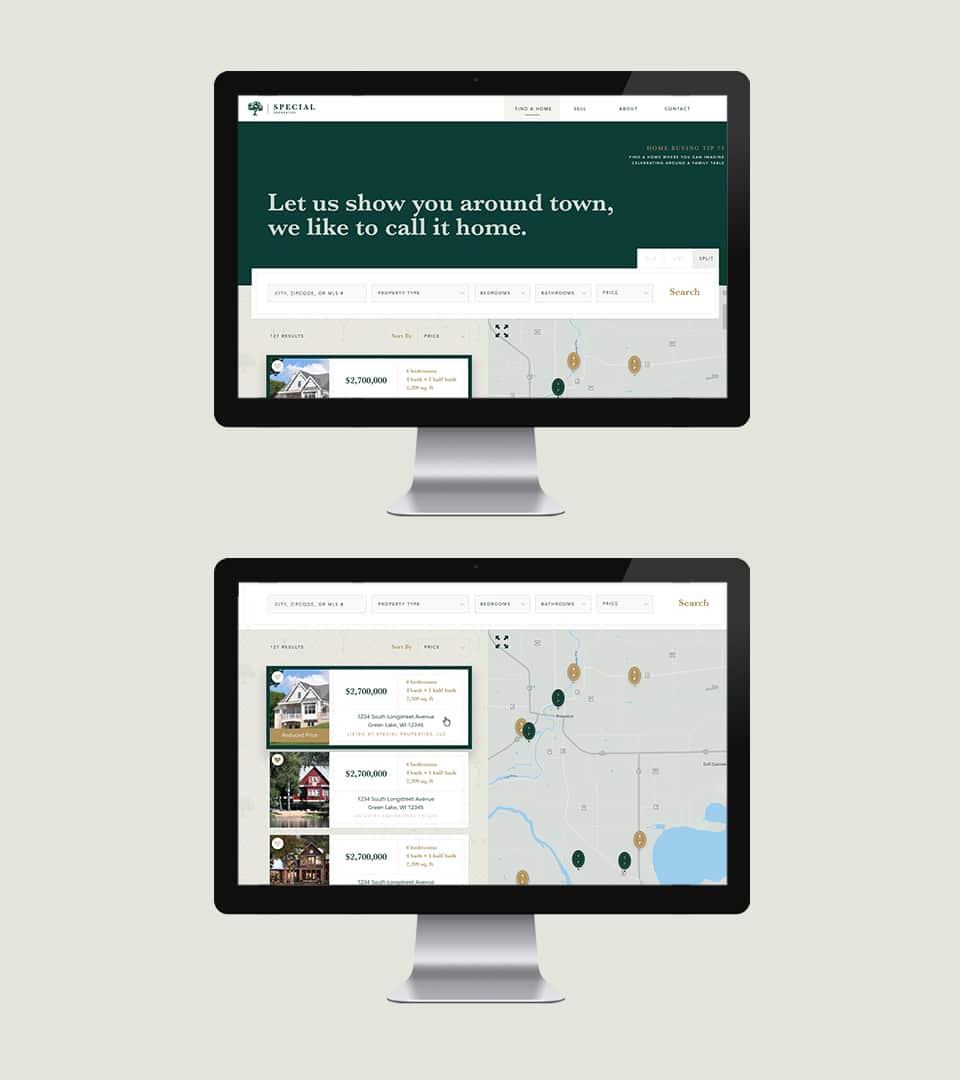
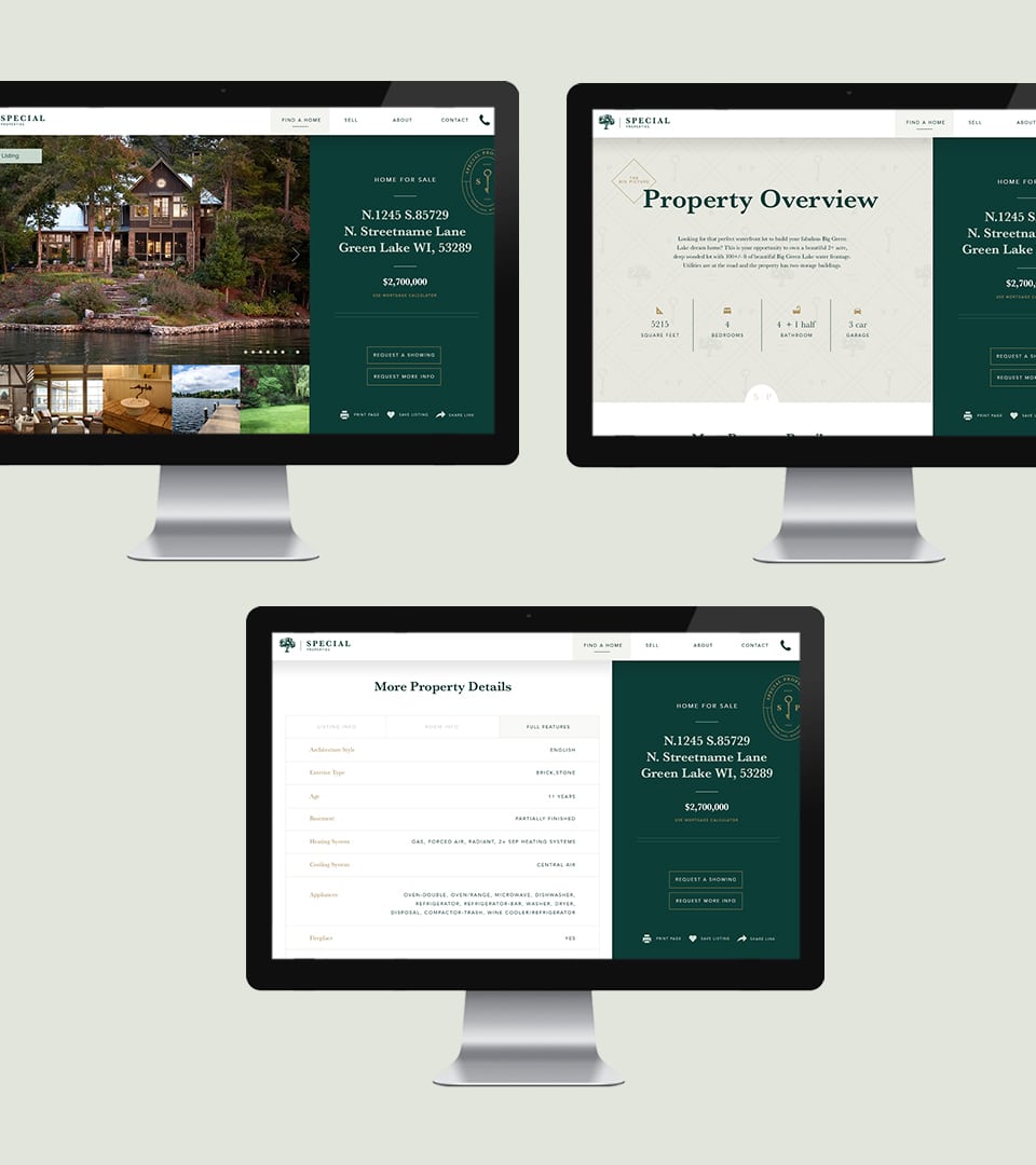
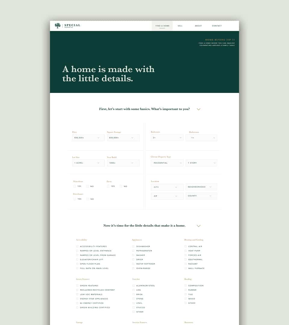
The digital experience had to reflect the calm nature of the Special team. Using a trusted real-estate content management and listing system, a friendly design walks users through the home–buying experience. With a focus on bringing the light-hearted and casual attitude to buyers or sellers in their own homes, home-buying tips are placed throughout the site, reminding potential buyers that their next holiday dinner will be shared around a table of a Special house. Easy-to-navigate forms and filters allow buyers to efficiently search for a place to call home.