BioActive
Nutrients
Services provided
Art Direction, Branding, Collateral Design, Design, Illustration, Logo and Identity, Package DesignCreative
Art Director
Designer
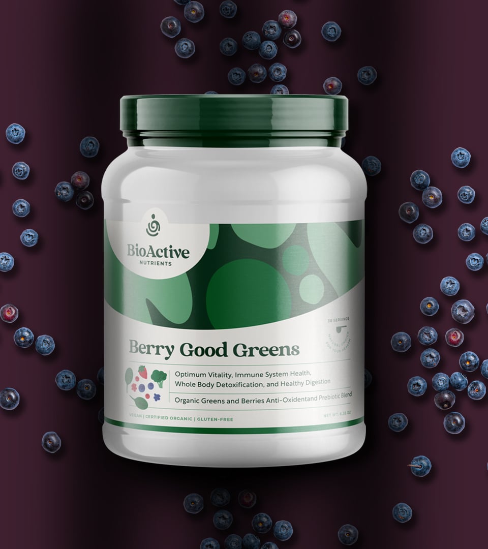
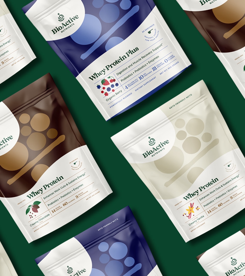
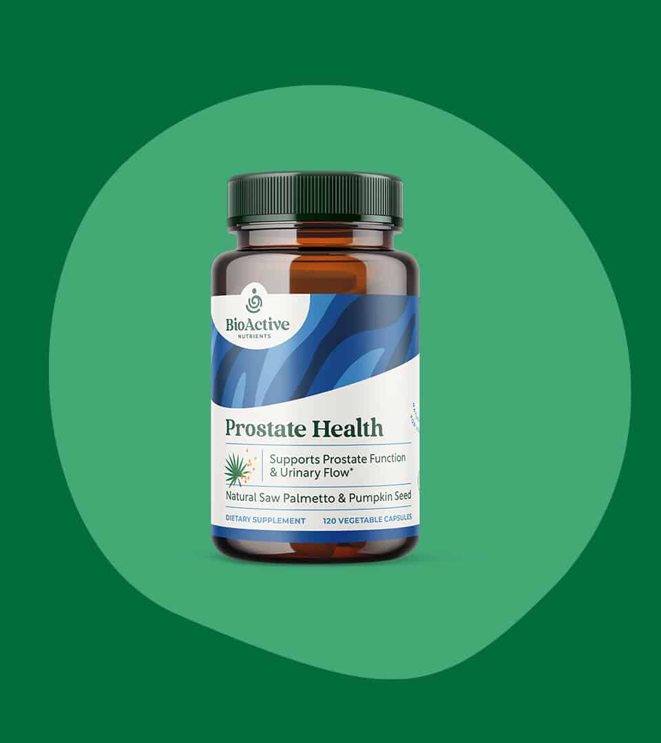
Using playful patterns, custom icons and illustrations, and an uplifting color palette, BioActive’s packaging system invigorates shelves. The diverse nutrients line stands out with bold and flexible label templates making it easy for the brand to add new products with confident consistency.


The identity system was motivated by the brand’s four key words values—Essential, natural, honest, healthy with an overall mission to uplift and invigorate daily routines. When tasked to refresh the brand, it was important to maintain the bright and free-spirited look through colors, typography and descriptive illustrations. A vibrant color palette and playfully-bold patterns are key elements to the package design system. Organic shapes mingle with soft and approachable typography to deliver pure and wholesome products.